ShopDreamUp AI ArtDreamUp

Deviation Actions


![[C] Saria, Hero of Time - Zelda AU](https://images-wixmp-ed30a86b8c4ca887773594c2.wixmp.com/f/39388ee8-2c52-4c99-a309-b1fcc95f6fdd/dd2449t-9054f797-a1b3-4fe2-8462-a9c32536a6ca.png/v1/crop/w_184,h_184,x_0,y_0,scl_0.092,q_70,strp/_c__saria__hero_of_time___zelda_au_by_calliecho_dd2449t-92s-2x.jpg?token=eyJ0eXAiOiJKV1QiLCJhbGciOiJIUzI1NiJ9.eyJzdWIiOiJ1cm46YXBwOjdlMGQxODg5ODIyNjQzNzNhNWYwZDQxNWVhMGQyNmUwIiwiaXNzIjoidXJuOmFwcDo3ZTBkMTg4OTgyMjY0MzczYTVmMGQ0MTVlYTBkMjZlMCIsIm9iaiI6W1t7ImhlaWdodCI6Ijw9MTI4MCIsInBhdGgiOiJcL2ZcLzM5Mzg4ZWU4LTJjNTItNGM5OS1hMzA5LWIxZmNjOTVmNmZkZFwvZGQyNDQ5dC05MDU0Zjc5Ny1hMWIzLTRmZTItODQ2Mi1hOWMzMjUzNmE2Y2EucG5nIiwid2lkdGgiOiI8PTEyODAifV1dLCJhdWQiOlsidXJuOnNlcnZpY2U6aW1hZ2Uub3BlcmF0aW9ucyJdfQ.jlQinhzCj7mUJzXroqeICbu2IEXW3VsOyIIlp_00WVs)
![[C] Saria, Hero of Time - Zelda AU](https://images-wixmp-ed30a86b8c4ca887773594c2.wixmp.com/f/39388ee8-2c52-4c99-a309-b1fcc95f6fdd/dd2449t-9054f797-a1b3-4fe2-8462-a9c32536a6ca.png/v1/crop/w_92,h_92,x_0,y_0,scl_0.046,q_70,strp/_c__saria__hero_of_time___zelda_au_by_calliecho_dd2449t-92s.jpg?token=eyJ0eXAiOiJKV1QiLCJhbGciOiJIUzI1NiJ9.eyJzdWIiOiJ1cm46YXBwOjdlMGQxODg5ODIyNjQzNzNhNWYwZDQxNWVhMGQyNmUwIiwiaXNzIjoidXJuOmFwcDo3ZTBkMTg4OTgyMjY0MzczYTVmMGQ0MTVlYTBkMjZlMCIsIm9iaiI6W1t7ImhlaWdodCI6Ijw9MTI4MCIsInBhdGgiOiJcL2ZcLzM5Mzg4ZWU4LTJjNTItNGM5OS1hMzA5LWIxZmNjOTVmNmZkZFwvZGQyNDQ5dC05MDU0Zjc5Ny1hMWIzLTRmZTItODQ2Mi1hOWMzMjUzNmE2Y2EucG5nIiwid2lkdGgiOiI8PTEyODAifV1dLCJhdWQiOlsidXJuOnNlcnZpY2U6aW1hZ2Uub3BlcmF0aW9ucyJdfQ.jlQinhzCj7mUJzXroqeICbu2IEXW3VsOyIIlp_00WVs)


Description
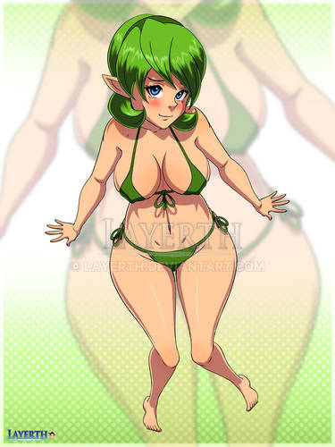
Update: Redid the face completely based on some new techniques  (Smile)")
Here is the old version:
:origin()/pre00/2fd9/th/pre/i/2017/357/c/6/saria_v2_by_diamondhour-dbxm9rk.jpg)
Update: Made some adjustments including a background gradient, some additional shading to the grass, additional hair rendering, and of course Navi!
~~ HEY LISTEN!!~~
Link's friend from Kokiri Forest, Saria - the Forest Sage!
Based on the poll, I started working on Cia, but ran into a bit of artist's block (is that a term?)
While doodling, I was playing around with different poses and ended up with something that I thought would work well for Saria. Funny enough I never really cared much for Saria and wasn't planning on including her in this series. It's interesting how spending so much time with a character can help you understand the character's appeal. I also think it's a shame that Saria wasn't in Hyrule Warrior.
Let me know who you'd like to see next from the Legend of the Zelda series!
At the top of my list are Cia, Princess Ruto, and Nabooru, but I plan to get to a lot more of these ladies.
Also from the Legend of Zelda series, I've done:
:origin()/pre00/6631/th/pre/i/2017/293/5/e/sheik_by_diamondhour-dbr4zel.jpg)
:origin()/pre00/06e5/th/pre/i/2017/308/5/7/princess_zelda_by_diamondhour-dbso5od.jpg)
Here is the old version:
Update: Made some adjustments including a background gradient, some additional shading to the grass, additional hair rendering, and of course Navi!
~~ HEY LISTEN!!~~
Link's friend from Kokiri Forest, Saria - the Forest Sage!
Based on the poll, I started working on Cia, but ran into a bit of artist's block (is that a term?)
While doodling, I was playing around with different poses and ended up with something that I thought would work well for Saria. Funny enough I never really cared much for Saria and wasn't planning on including her in this series. It's interesting how spending so much time with a character can help you understand the character's appeal. I also think it's a shame that Saria wasn't in Hyrule Warrior.
Let me know who you'd like to see next from the Legend of the Zelda series!
At the top of my list are Cia, Princess Ruto, and Nabooru, but I plan to get to a lot more of these ladies.
Also from the Legend of Zelda series, I've done:
Image size
2550x2850px 2.52 MB
© 2017 - 2024 DiamondHour
Comments34
Join the community to add your comment. Already a deviant? Log In
the grass would possibly would look better if there was more of it or/and if there was coloring under the grass.
the stub would look better if there texture wasn't straight. the texture of trees never point just in one way, those curl around . I recommend using references.
the face would make more sense if the nose was more detailed. right now it's just a line, that makes it look kinda weird.
the hair would look a lot better, if there was a little loose hair with it.
________________________________________________________________
I really like the colors of this artwork.
I think that the over all idea of this picture is really good, however the white background is a little boring,
even tho you used a lot green with this art-piece, you made sure that the coloring still matches. the anatomy is really good too.
keep up the good work!